All About the Structures

Explore each Superstructure to see how it helps teams organize ideas, surface perspectives, and move toward better decisions. Each structure provides a simple framework for tackling common workplace challenges. Use the buttons below to explore each one and see examples from across the organization.

ConnectNoteboardVennDebateDot PlotWebPollSequenceColumnsSpectrum

Connect

Ideal for Brainstorming, Sharing Perspectives & Surfacing Insights

Connect invites participants to contribute ideas related to a central topic and share their perspectives. Each contribution includes a title and a short explanation. Teams can explore what colleagues have added, creating a shared view of the knowledge, insights, and perspectives across the group. Check out our sample collection of Connect structures.

Retrospective diagram with colorful petal shapes listing reasons why a new game launch failed, including issues like onboarding speed, monetization concerns, data errors, and launch crashing, attributed to team members Jordan, Dani, Theo, Marcus, and Priya.

Participants share thoughts about a product launch...

Retrospective note titled 'No "aha moment" in day one' explaining the game mechanic that makes the game special appears only at level 4, causing early player churn.

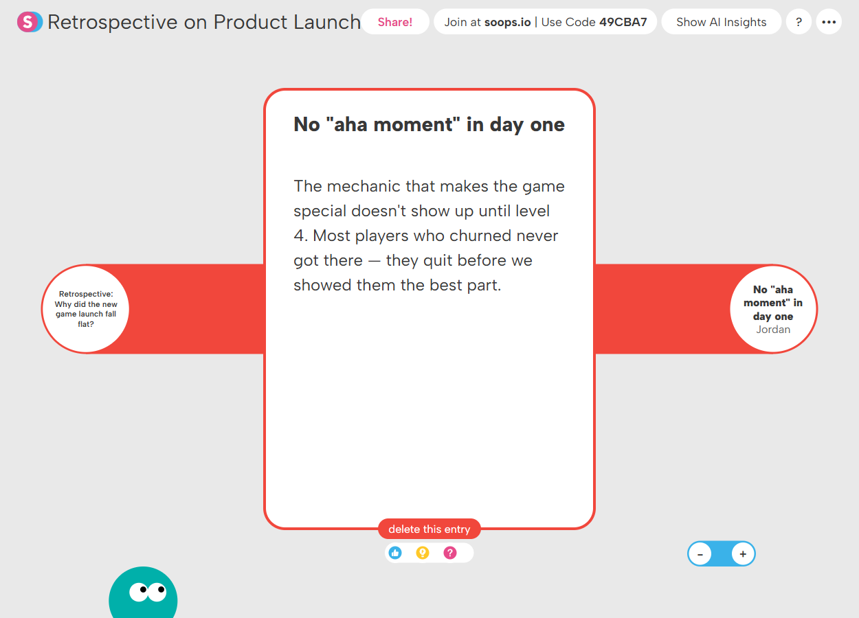
...and explain their thinking in detail.

Noteboard

Ideal for Idea Generation, Clustering Insights & Identifying Priorities

Noteboard invites participants to contribute ideas in response to a topic or question. Everyone adds notes freely on a shared canvas and can move them around to group related ideas, prioritize themes, and organize information as the conversation develops. Check out our sample collection of Noteboard structures.

Digital noteboard titled 'Marketing Content Ideas' with categorized sticky notes including Focus on real kids, Rainy day positioning, Teacher testimonials, and Literacy & parenting research drives many of our users, containing various marketing content ideas for a children's storytelling subscription box.

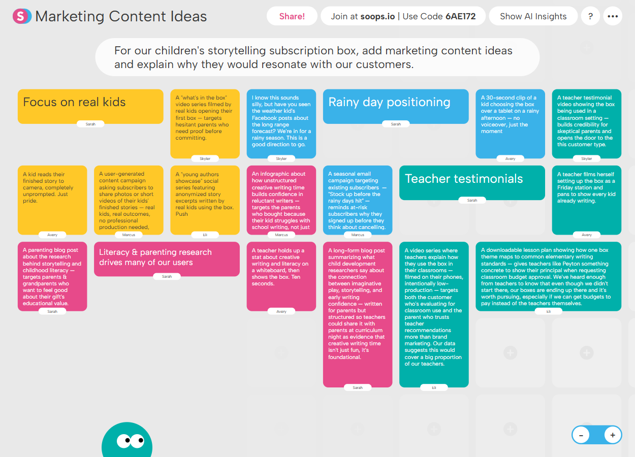
Brainstorm and group ideas about new content...

Screenshot of a digital marketing content ideas board for a children's storytelling subscription box, showing colored notes with various marketing strategies and explanations.

...developing those ideas for further review.

Venn

Ideal for Comparing Ideas, Identifying Overlap & Understanding Differences

Venn invites participants to generate ideas and place them into overlapping categories. Users identify similarities and differences, clarify where ideas belong, and see how perspectives align or differ across the group. Check out our sample collection of Venn structures.

Venn diagram titled 'Finding Channel Overlap' showing overlap between Email & Newsletter and Social & Community channels with labeled content types and a color-coded legend for content categories.

A marketing team explores overlap in their channels...

Venn diagram showing overlap between Email & Newsletter and Social & Community channels with a note explaining blog post promotion links to the same URL from both channels.

...and reflects on what's happening in the process.

Debate

Ideal for Evaluating Arguments, Exploring Perspectives & Strengthening Decisions

Debate invites participants to build arguments for or against a proposed idea or decision. Users can contribute their own reasoning, respond to colleagues’ perspectives, and consider the range of arguments shared by the group. Check out our sample collection of Debate structures.

Comparison chart of growth strategy debate between staying small to win on reputation and scaling aggressively to compete on capacity with key points from different contributors.

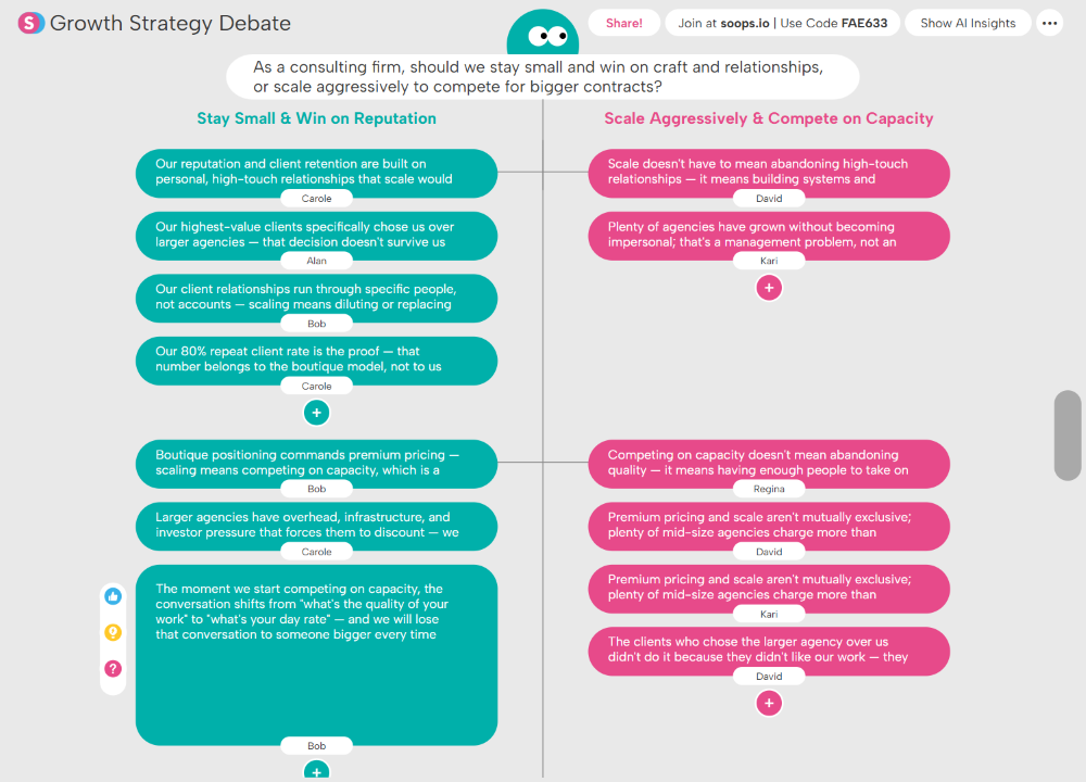
Participants debate the best strategy moving forward...

Diagram titled 'Scale Aggressively & Compete on Capacity' featuring three pink speech bubbles with text on business scaling risks and benefits attributed to Jesse, Regina, and Kari.

...building on and reacting to each others' ideas.

Dot Plot

Ideal for Analyzing Options, Surfacing Tradeoffs & Informing Decisions

Dot Plot invites participants to evaluate ideas across two dimensions. Users position each idea on the grid, explain their reasoning, and explore how others have assessed the same ideas across the group. Check out our sample collection of Dot Plot structures.

Risk/Reward Matrix with yellow grid and white dots scattered, left panel listing tasks, right panel showing details for selected dot 'Content marketing push' describing it as the lowest barrier to entry without a sales team.

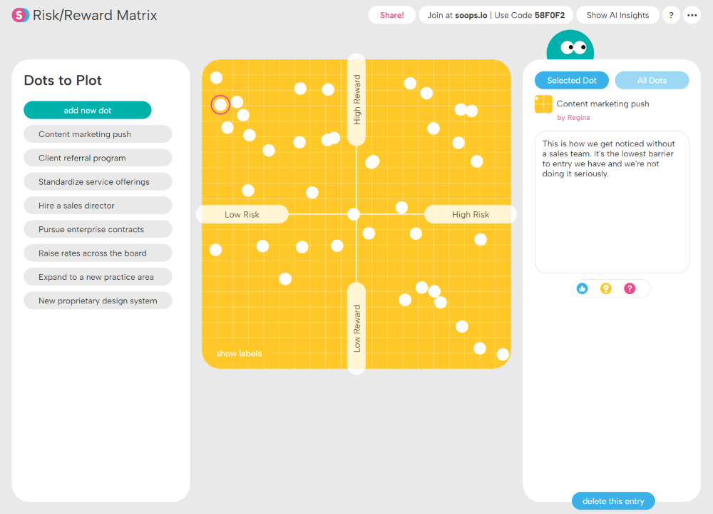
Participants plot potential moves according to risk & reward...

Interface showing a risk-reward scatter plot with white dots on an orange grid, highlighting a selected dot with a red outline near the intersection of 'High Risk' and mid 'High Reward', with details on the right explaining it as an expansion into a new practice area with higher risk but greater potential ceiling.

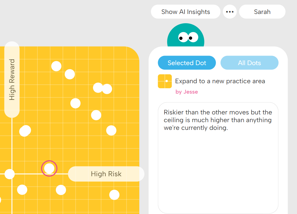
...and justify their reasoning for the placement.

Web

Ideal for Mapping Ideas, Exploring Connections & Seeing the Bigger Picture

Web invites participants to generate ideas and map the connections between them. Users can add new contributions that extend from existing ones and link ideas together to reveal relationships across the group. Check out our sample collection of Web structures.

Diagram titled 'Industry Forces Map' showing a central red circle labeled 'The UX Consultancy Market' connected to various colored circles representing market forces, including price wars, large agencies dropping prices, in-house UX teams, freelance marketplaces, AI tools, and data privacy laws.

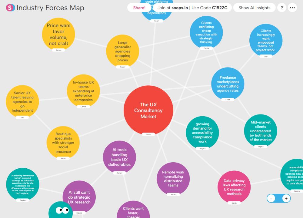
Participants map industry forces...

Diagram with purple and teal circles containing text about AI in UX research, including topics like AI tools handling basic UX deliverables, AI accelerating client expectations for speed, AI still missing strategic UX research, clients wanting faster, cheaper research sprints, and AI creating demand for human-centered strategy.

...developing connections that generate new ideas.

Poll

Ideal for Voting on Ideas, Building Consensus & Informing Decisions

Poll invites participants to vote on a question or decision. Users select an option, explain their reasoning, and see how others across the group voted — helping teams quickly understand where opinions align and move toward a clear decision. Check out our sample collection of Poll structures.

Poll results on team focus priorities showing three options: 'Expand into underserved communities,' 'Deepen impact where we already work,' and 'Invest in staff capacity & infrastructure,' with participant comments under each.

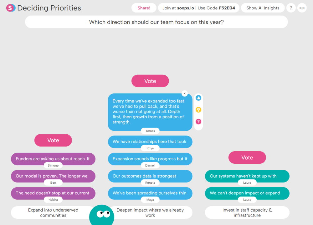
Participants vote on a strategic course for the year...

Part of a digital mind map showing blue text bubbles with names and partial quotes about community growth and outcomes, along with reaction icons for like, question, and confusion.

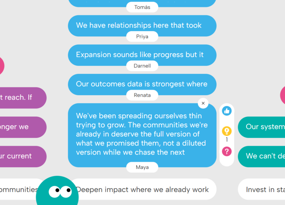
...reflecting on their reasons for their choice.

Sequence

Ideal for Defining Processes, Comparing Approaches & Improving Workflows

Sequence invites participants to generate ideas that follow a defined pattern or process. Users contribute their own responses and review how others approached the same sequence, revealing different ways teams can move through a process or workflow. Check out our sample collection of Sequence structures.

Customer journey mapping chart showing five stages—trigger, discovery, consideration, purchase, unboxing—across four personas named Skyler, Avery, Jordan, and an unnamed fourth persona with corresponding colored text boxes detailing their actions and thoughts.

Participants map out different customer journeys...

Customer journey mapping chart with columns labeled Trigger, Discovery, Consideration, Purchase, Unboxing, detailing user experiences from Sarah, Marcus, and Eli in colored text boxes.

...each tracking a different one to build a full overview.

Columns

Ideal for Gathering Ideas, Organizing Categories & Comparing Options

Columns invites participants to contribute ideas within defined categories. Users can add multiple contributions and review how ideas are distributed across the categories, helping teams compare options and make more informed decisions. Check out our full sample collection of Columns structures.

Roadmap Source Audit chart with five columns labeled Customer Request, Sales Promises, Support Escalation, Research Finding, and Strategic Bet, each containing color-coded task bubbles with names.

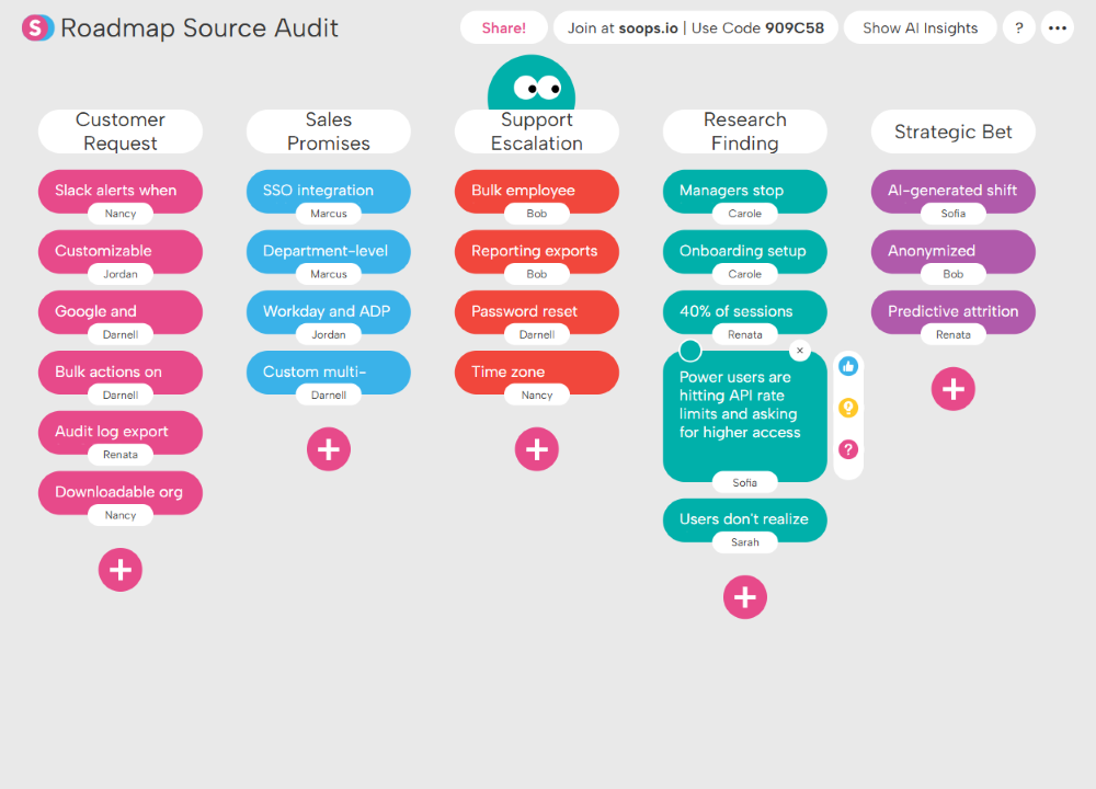
Categorize sources of ideas...

Diagram with three columns labeled Customer Request, Sales Promises, and Support Escalation, listing tasks with assigned names including Slack alerts, onboarding checklists, SSO integration, department-level, Workday and ADP, bulk employee, reporting exports, password reset, and time zone.

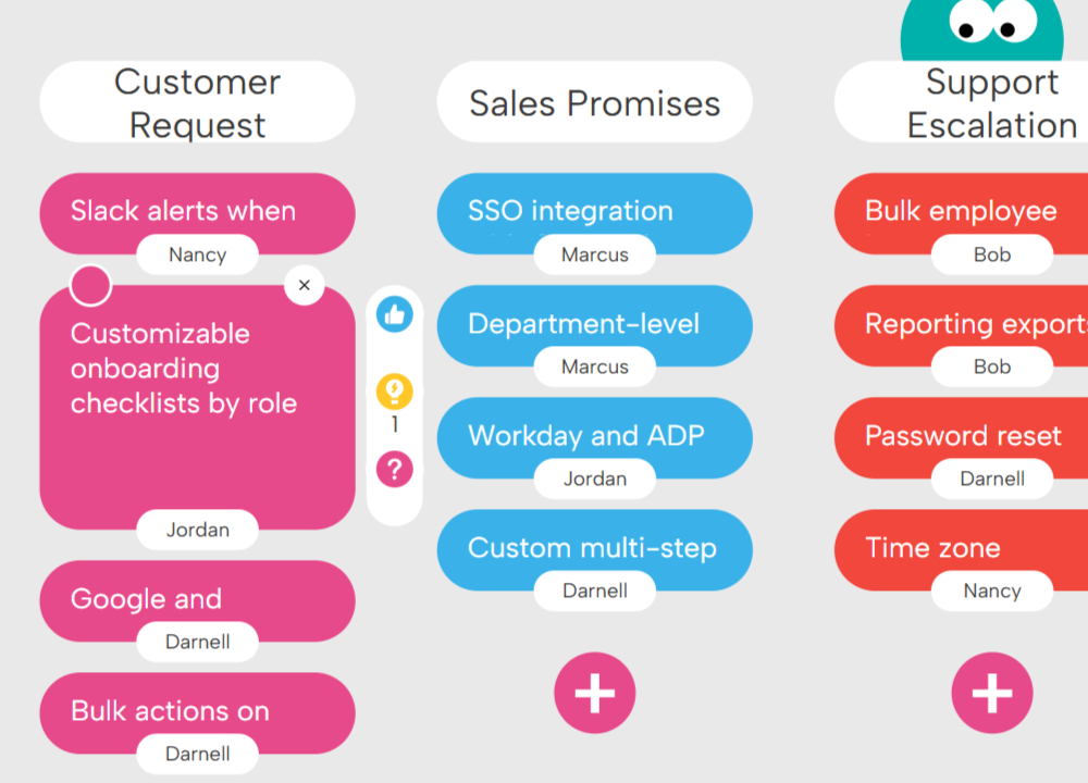
...building on and reacting to teammates' contributions.

Spectrum

Ideal for Analyzing Ideas, Evaluating Options & Weighing Tradeoffs

Spectrum invites participants to analyze ideas by positioning them along a continuum between two defined poles. Users place ideas along the scale, explain their reasoning, and see how others across the group evaluated the same ideas — helping teams surface nuance and make more balanced decisions. Check out our sample collection of Spectrum structures.

Campaign Message Testing interface with a yellow bar chart of white dots ranging from 'Too Safe & Forgettable' on the left to 'Bold & Memorable' on the right, featuring a teal character button labeled 'add new dot' below.

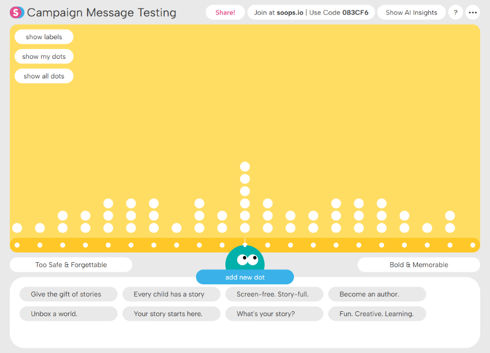
Participants rank marketing messages...

Interface of a digital timeline with speech bubble highlighting a comment saying, 'Screen-free. Story-full. This one would make me pause. It feels like it understands why I'm looking for something like this.'

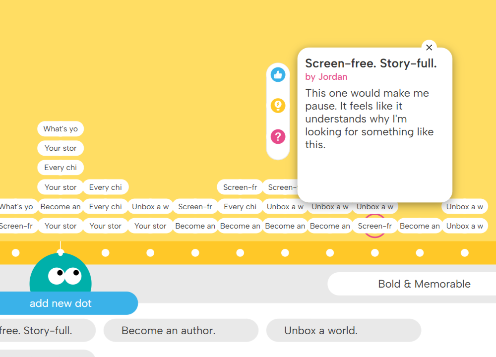
...reflecting on which direction they should go.

Back to TopMake a Superstructure